When people imagine a cinema, they often picture the technology: the projector, the giant screen, maybe even the leather recliners. But there’s one element that most clients — and many designers — overlook: The room itself is part of the image.
That may sound odd, but think about it: The light coming off the screen doesn’t vanish into thin air. It bounces around the room. Every surface, every color, every reflection interacts with the picture. Get those wrong, and even the best projector and screen combination can look washed-out, distorted, or oddly colored.
For architects and interior designers, this is both a challenge and an opportunity. It’s a challenge because cinema rooms demand a more disciplined approach to finishes than other parts of the house. It’s an opportunity because, handled well, those same finishes can elevate the room into a refined, purpose-driven space where the architecture and the image work in harmony.
Why Reflections Kill Contrast
Contrast — the difference between the darkest blacks and the brightest whites — is the single biggest factor in how cinematic an image feels. A projector can have incredible specifications on paper, but if the room is full of reflective surfaces, those specs collapse in practice.
Here’s why: Light from the screen hits a shiny floor, a white wall, or a glossy ceiling and bounces straight back into the viewing area. Instead of deep blacks, you get a gray haze. Instead of vibrant colors, you get a muted wash. It’s like watching a movie in a hall of mirrors.
Home Theater Week: Motivated by Makeovers
The result? A space that never quite feels cinematic, no matter how good the technology.
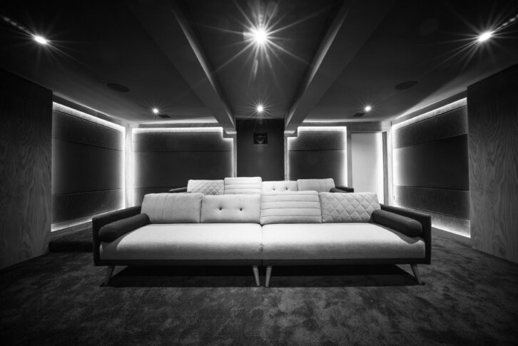
One of the simplest, most effective design moves is to establish a dark zone around the screen. This means keeping at least a meter — ideally two — around and above the screen surface as dark, matte, and non-reflective as possible.
Flat black is the gold standard here. It absorbs stray light, prevents reflections, and frames the image so that the screen appears to “float.” Even deep charcoals or muted tones can work if true black is aesthetically too stark, but the principle remains: The closer to black, the better.
Think of it like a picture frame in a gallery. The artwork shines because the frame recedes. The same applies in cinema design.
Color Choices: Why Neutrality Matters
Color has a sneaky way of influencing perception. If walls or ceilings are painted in bold hues, the light reflecting from the screen picks up those tones and throws them back onto the image. A cream wall can make whites look yellow. A bold blue feature wall can shift the color balance across the entire screen.
That’s why cinema designers tend to specify neutral palettes — grays, charcoals, or natural timber tones that don’t interfere with the picture. This doesn’t mean the room has to look dull. Subtle textures, layered materials, and clever lighting can create atmosphere and richness without compromising neutrality.
Home Theater Week: Next-Generation Audio Roundup
Lighting: Friend and Foe
Lighting design in cinemas is a delicate dance. On one hand, you need to navigate the space safely, find your drink, and create ambience. On the other, any stray light falling on the screen destroys contrast. Key considerations include:
- Color temperature: Stick to neutral white lighting. Warm amber tones may look cozy in a lounge but will tint the image in a cinema.
- Directionality: Aim light away from the screen. Wall washes, floor-level LEDs, or indirect coves can provide useful illumination without spilling onto the picture.
- Control: Layered, dimmable circuits are essential. Clients should be able to move from bright cleaning light to subtle mood lighting to complete blackout with ease.
Handled well, lighting becomes an architectural feature that enhances immersion rather than undermines it.
Surfaces and Materials: Less is More
Cinemas often tempt designers to add statement finishes — polished stone, high-gloss joinery, or mirrored details. While these might look stunning in a bar or lounge, they’re deadly in a cinema.
Instead, think of cinemas as places where restraint pays off. Matte paints, textured fabrics, acoustic wall panels, and absorbent finishes should dominate the palette. This doesn’t mean the room has to feel austere; rather, it should feel deliberate, with every surface serving both an aesthetic and a performance role.
Home Theater Week: Unlocking Professional Audio Precision
Timber slats, for example, can add warmth while doubling as acoustic diffusion. Upholstered panels can conceal treatments while softening the look. The trick is finding materials that are visually pleasing but acoustically and optically neutral.
The Role of Ceiling Design
Ceilings are often overlooked, but in cinema design they matter greatly. A white, reflective ceiling will throw light back onto the screen, cutting contrast and immersion. Options include:
- Dark paint or stretched fabric: simple, effective, and easy to integrate.
- Star ceilings: Fiber-optic “star fields” are popular, adding atmosphere while still absorbing light.
- Acoustic ceilings: treated surfaces that reduce reflections and add comfort.
Again, the goal is to make the ceiling recede visually so the audience’s focus stays firmly on the screen, but still keep it aesthetically pleasing to the end user when the room is not in use.
A Cautionary Tale: Beauty Versus Performance
In one project, the interior designer specified a pale stone floor and high-gloss lacquered paneling for a cinema. It looked incredible in renders — a modern, luxurious space. But when the projector fired up, the entire room lit up like a lantern. Blacks turned gray, colors dulled, and the sense of immersion evaporated.
The eventual solution? Retrofitting rugs, matte finishes, and acoustic panels at additional cost. The room recovered, somewhat, but it was a painful reminder that in cinema, aesthetics cannot be separated from real performance when it really matters.
The Architect’s Role
For architects, the takeaway is clear: Treat the cinema not as a decorated room but as a carefully tuned viewing environment. Just as gallery architects consider wall color, glazing, and lighting to enhance art, cinema architects must consider finishes, reflectivity, and color neutrality to enhance film.
You don’t need to sacrifice beauty; you just need to channel it in ways that support the image. Subtlety, restraint, and neutrality can still be elegant — and in the right hands, more so than flashier finishes.
Conclusion
A private cinema is more than its technology. The room itself is part of the image, shaping what clients actually see. Reflections, colors, and lighting can either elevate or undermine the experience.
Home Theater Week: How to Solve the Center-Channel Challenge for dvLED Video Walls
By creating a dark zone around the screen, choosing neutral palettes, controlling light carefully, and avoiding reflective surfaces, architects and designers can ensure the image shines as intended.
In short: Design the room as if it’s another component of the projector system. Do that, and the technology disappears, leaving nothing but the story on screen.